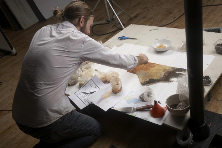

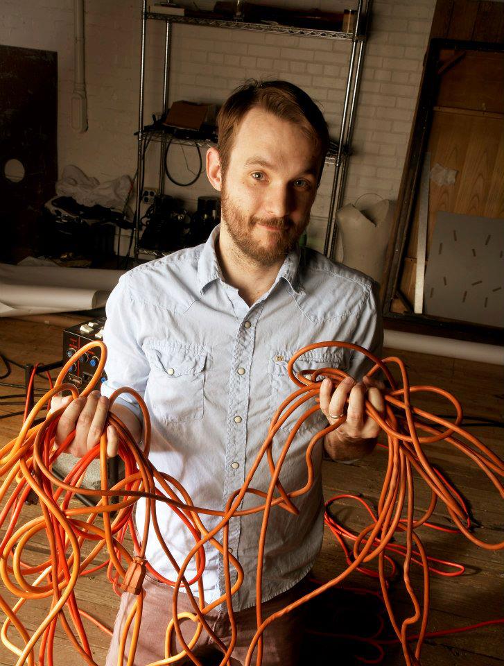
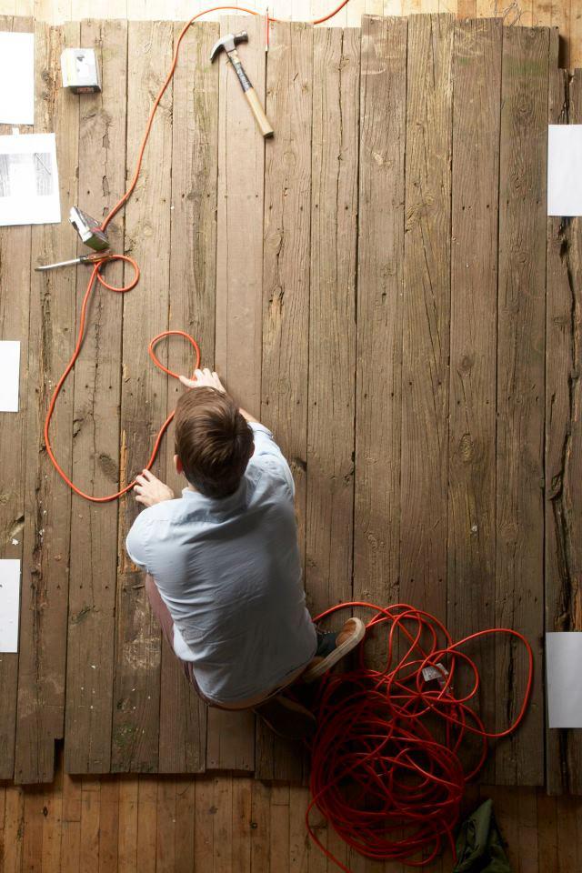
We were working on a story about a group of squatting pioneers on the Outer Banks of NC that had little to no available photography. Worked up this concept for the opening spread based on the group’s adopted name. Made it happen in the studio, and it wound up being one of my favorite shoots.


More fun making typography in the studio with real life props. (Butter, tobacco and a screen door. Tried and failed to grow a kudzu font for the same issue. Can’t win em all)


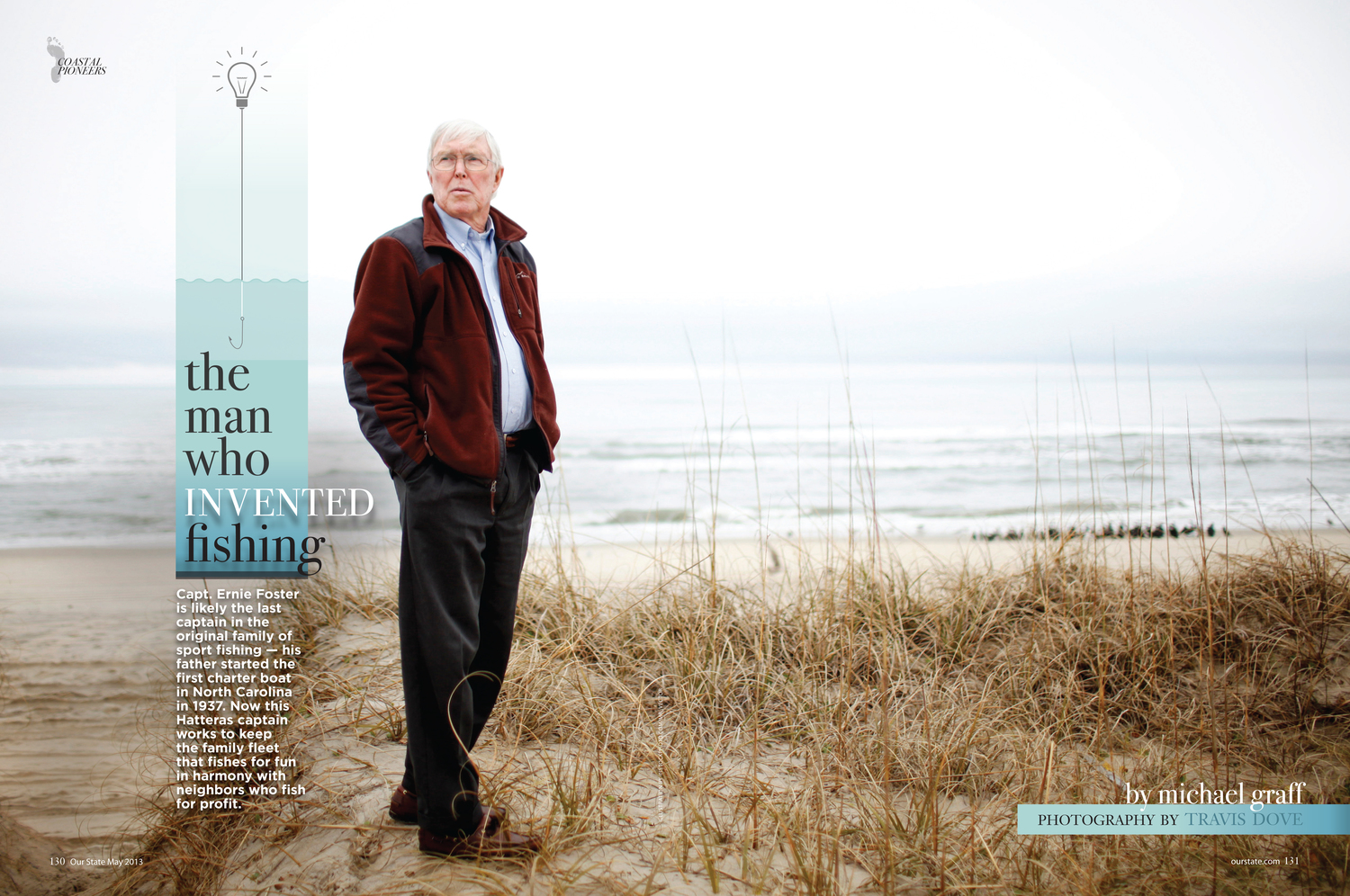
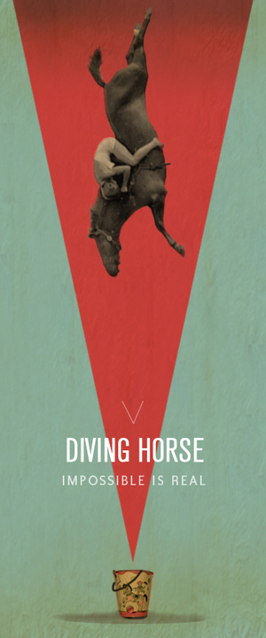
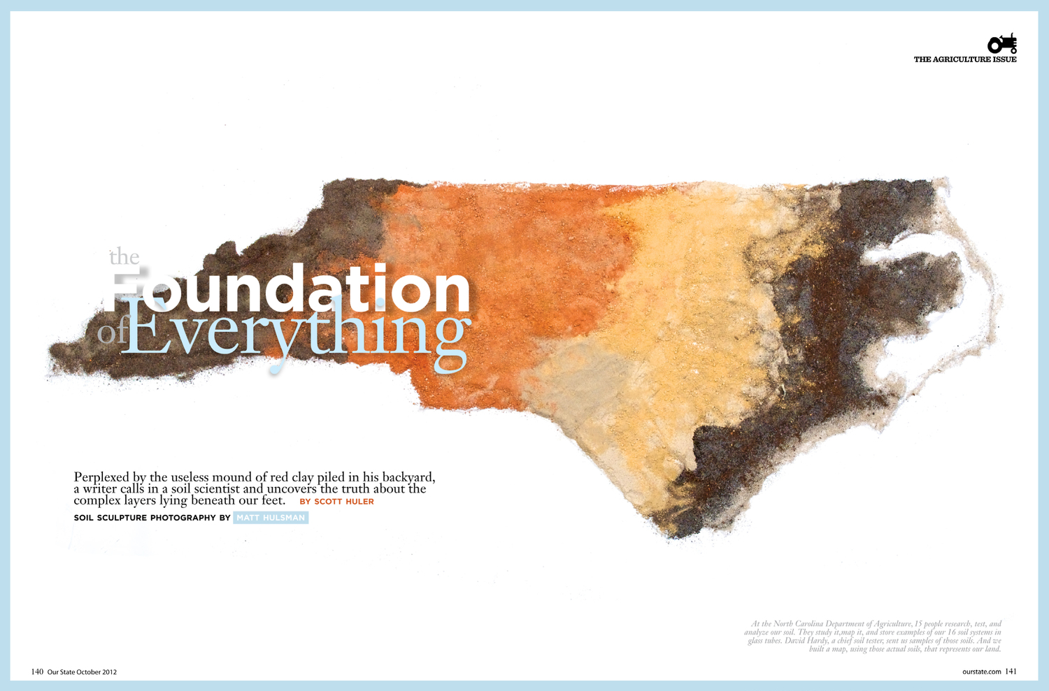
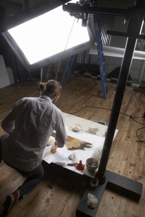
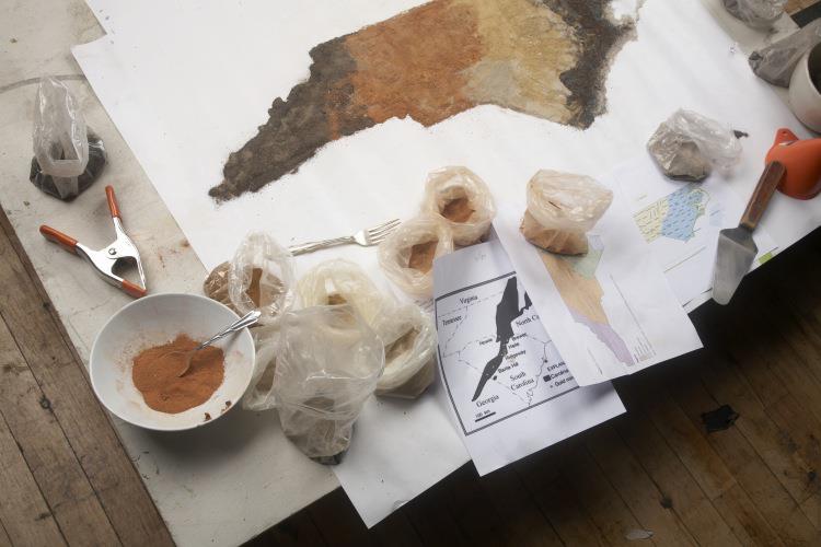
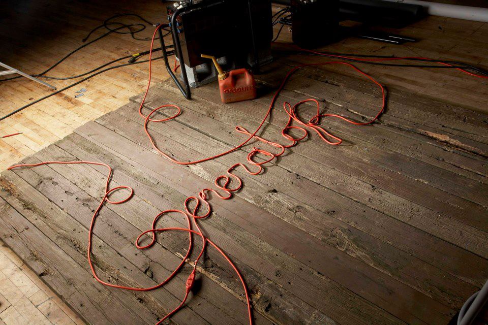
I included this one because I wrote the title ( which designers rarely get to do. ) That title heavily informed the design and I always liked it.